Warning: Graphic Content
RETURN
by Tony Moles, Exhibit Network Creative Director
Well-designed graphics in your exhibit can be the single factor that elevates a booth from just ‘okay’ to great. With that in mind, we’ve put together three simple tips to help you make the most of your exhibit graphics.
1. KISS: Keep It Simple. Seriously.
It seems almost too good to be true. Hundreds and hundreds of square feet of graphics. Finally, room for you to include all of those things you couldn’t fit into your brochure. It feels limitless. Endless opportunities to tell potential customers EVERYTHING about you! Don’t even think about it.
Just because you CAN fill every square inch of your exhibit graphics with charts, graphics, technical info, and product features doesn’t mean you SHOULD. The simpler the story you tell and the more readable the message, the more absorption and retention for your audience.
Consider a billboard: Enormous medium, simple messaging. The same holds true for exhibit graphics. Although your audience is strolling by in the aisles rather than zooming past on the freeway at 60mph, the basic objectives remain the same: Get attention. Cut through the visual noise. Let them know who you are and what you do.
Aside from more effectiveness, there’s a practical reason for the “less is more” approach. The more detail you include in your graphics, the more you undermine their longevity. Things like comprehensive product listings or technical information can quickly become outdated, which will require reprinting of graphics and thereby increase your exhibit costs, impacting your ROI for future shows. Save the details for a handout or motion graphic.
2. Image is (almost) Everything
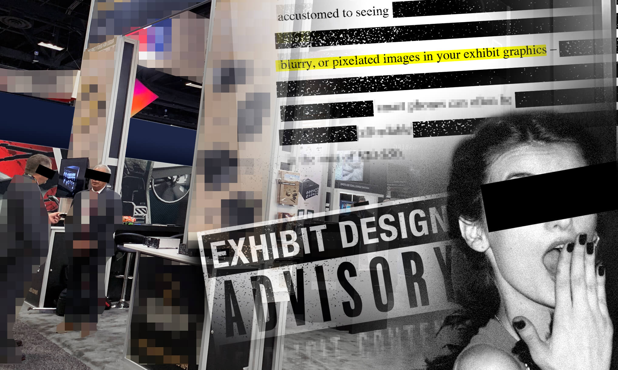
As superficial as this may sound, it’s true, more now than ever. The proliferation of smart phones and prosumer DSLRs mean the printed image that audiences are now accustomed to seeing is both infinitely higher in quality and lower in cost. That built-in expectation that our eyes now have means there’s no longer any excuse for poor quality, blurry, or pixelated images in your exhibit graphics – regardless of scale. This doesn’t mean incurring the expense of a professional photographer, either. Photos taken with recent generation smart phones can often be enlarged to fill a 20’ wide graphic. Alternatively, affordable online stock photo resources abound, with average image costs in the area of $20-$50.
Terms like “resolution” and “dpi” can seem overly technical and confusing to non-designers but you don’t have to be a pro to get great results. Just arm yourself with these few basic rules when developing your exhibit graphics: A) Don’t expect to pull something off of your website and blow it up. B) Don’t expect to copy and paste out of a PowerPoint, and C) a low quality, blurry image can’t be “photoshopped” to make it printable. Beyond that, let your graphic designer or marketing team lead you, and listen to them; they’ve got the same goal as you, getting your printed image to look as great as possible.
3. Repurpose. Reuse. Recycle.
Exhibit graphics are themselves a valuable tool to communicate to your audience, but should be seen as one piece of a larger communications package. Print literature, video messaging, and promotional giveaways are all equally important components in the customer-facing suite of tools presented at a trade show. The consistency among these pieces is absolutely crucial to communicating a singular identity of your company to booth attendees. The good news is, achieving this consistency can be very simple.
Already have a brochure? Repurpose design elements from within it for your exhibit graphics. Recycle copy points. Seek to get the original design files from the brochure for your exhibit graphic designer to work from. Already have a 3D animation to play in your booth? Have your 3D artist provide a high-quality rendering from a single frame of it for use in your graphic panels. Repurposing common elements reinforces the consistency for which you should strive. These consistent elements – along with adherence to your company’s existing brand standards in the use of typefaces, colors and images – will result in a seamless customer experience from the moment they step foot in your booth.
By committing to just these guidelines, you’ll be better positioned to effectively communicate your message to – and improve the experience of – the visitors to your booth.
Have any additions to this list you’d love to see us add in future posts? We’d love to hear from you! Email team@exhibithouston.com.