Red Stone Resources
RETURN

The Challenge:
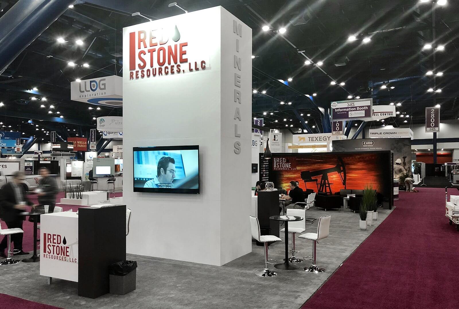
Red Stone Resources, LLC was founded in 2012 and had always exhibited in a 10×10 booth space. To reflect their rising prominent position in leasing and acquiring mineral rights, Red Stone decided that Summer NAPE 2017 was the time to be more aggressive on the show floor. At first, Red Stone’s exhibit committee was unsure of the best way to represent their growing company. After much dialog and idea-sharing with Exhibit Network, everyone agreed that Red Stone’s 20×30 island exhibit needed distinct visibility on the show floor and a semi-private hospitality area.
The Solution:
Exhibit Network focused on Red Stone’s need for distinction and prominence on the show floor. The large tower structure reflected their importance in the industry as well as clear visibility without the expense of an overhead sign. Our design emphasized the oil drop motif from their logo throughout the exhibit for brand awareness and memorability. Red Stone provided the artwork for the large-format graphics. Red Stone was ecstatic with the steady flow of qualified booth traffic at Summer NAPE 2017.

